Yamachu visualizes data with aXes and Google Charts
This case study is based on a case study that was published in iMagazine Japan www.imagazine.co.jp
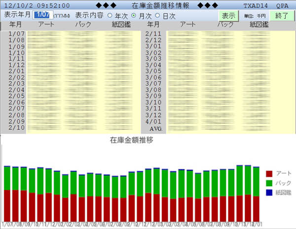
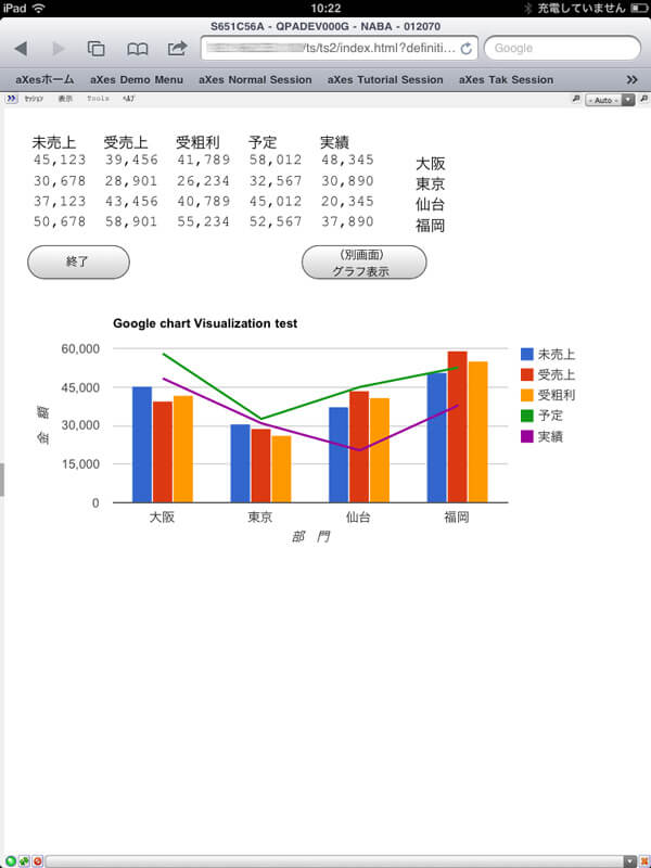
‘A picture is worth a thousand words’ and many companies go through extensive projects and substantial costs to implement dashboards and business intelligence systems to show their data graphically. Yamachu, a paper wholesaler based in Niigata City, Japan, implemented a very practical solution to visualize its data in just one month. Yamachu used aXes and Google Charts to present data captured from 5250-screens in charts and graphs that management can explore interactively from their desks, or from outside the office using their Smartphones.
The Challenge
Yamachu is an expert on all matters related to paper, based on knowledge accumulated since the company’s establishment in 1871. Yamachu’s art media division provides recommendations such as the adequacy of printing, processing and designing paper; it also advises and supplies to various print-related industries. Its package media division supplies packaging materials across industries, with the processed food industry being a major customer. Its paper retail division sells a variety of stylish paper products in small quantities to design & print professionals and hobbyists through its showroom in Niigata and also via its on-line store,
www.kamizukan.jp.
Yamachu started using the IBM S/34 in 1979 and has remained with IBM ever since. The company’s purchase, inventory, sales and distribution systems are running on IBM i. All systems have been developed by Yamachu’s in-house RPG team and have been continuously updated in response to Yamachu’s business requirements.
Mr Yoneta, responsible for systems management and e-business promotion, noticed for several years how division managers were struggling to present data in a meaningful way to Yamachu’s president during meetings. Their reports tended to explain numbers and data in too much detail, while the president was more interested in seeing the bigger picture. Occasionally the managers used Excel charts, but it was very time consuming to prepare and the outcome wasn’t always satisfactory.
Mr Yoneta wanted the system to be able to visualize the management data, as a means to reduce the time needed to understand data and to allow management to respond quicker with the appropriate action. He started to look for a tool that can display DB2 data in a browser and that can illustrate that data in graphs and charts.
“Division managers were struggling to present data in a meaningful way”

The Solution
“When I was reading iMagazine Japan, a product called aXes grabbed my attention since it contained all the features I wanted. I immediately contacted Fairdinkum, the Japanese distributor. We downloaded the trial version and tested it,” explained Mr. Yoneta. “Shortly after the trial period, I decided to proceed with full implementation, since aXes was easy to operate and provided the desired features at a low cost,”
aXes is a tool to transform 5250 applications into GUI browser-based applications automatically simply by installing it. Mr Yoneta took specific notice of one of aXes standard features, which is to synchronize data with an internet application, like Google Charts. Just as its famous sister product, Google Maps, can visualize address information in maps, Google Charts can visualize quantitative information in charts and graphs. The Google Charts API is supplied by Google. All you need to do is to provide parameters to the specified URL using a simple script.
Mr. Yoneta commented, “I liked the fact that aXes came with plenty of examples and FAQ information that I could easy follow. By using the tutorials I managed in about one month to develop and implement a solution that presents our key business data in graphs. We purchased aXes towards the end of February and management could view their data on Google Charts by April.”
“aXes was easy to operate and provided the desired features at a low cost”

The Benefits
Mr Yoneta prepared a variety of real-time interactive reports, using purpose written RPG programs, aXes and Google Charts. The reports, such as sales statistics and inventory status reports, are available in a variety of bar graph and pie charts and the reporting period can be set to daily, monthly and yearly. The charts can be drilled down for further investigation of the data.
As just one example of an immediate practical benefit of being able to visualize data, Yamachu now has a better way of dealing with slow moving items. Yamachu has a rule stating that all products must be sold within 18 months after purchase. However, this rule could not always be adhered to in the past. Now with the new aXes and Google Charts solution, it is much easier to identify which products nearing their expiration date are still in stock and the appropriate action can be taken.
The management data that the division managers present in their meetings with the president is now also visualized in Google Charts. Communication between the president and division managers has improved. When the president notices something unusual in a chart, he can quickly check the actual data. Since both the high level charts and detailed data are available, it is now easier for the president to understand the comments from the managers and he can feel more confident that he has the correct information available for making decisions.
“By visualizing data, Yamachu has a better way of dealing with slow moving items”
Conclusion
aXes web-enabled screens can be accessed by Smartphones and other mobile devices. Mr. Yoneta is already using his Android device to connect to the system from outside the office. Yamachu’s president may also soon make use of aXes mobile data access and be able to view his company’s data anytime from anywhere using his Smartphone.
Since aXes only requires a server license and does not charge by user, the licensing costs will not increase when the number of internal web users is expanded. Yamachu is planning to increase its use of aXes and visualize more data with Google Charts, web-enable additional 5250 screens and provide more users with Smartphone web access to its IBM i systems.
“Several staff members are already using their mobile device to connect to the IBM system via aXes Mobile”
Company and System Information
- Yamachu, established in 1871, is paper wholesaler based in Niigata City, Japan. Capitalized at ¥10 M, sales in 2010 was ¥1.3 B and the number of employees 29. Yamachu has several divisions dealing with the printing and packaging requirements of corporate customers and an online shop (www.kamizukan.jp)
catering to design & print professionals and hobbyists. - For more information, visit www.yamachu.com
- In Japan, aXes is available from Fairdinkum (www.fairdinkum.co.jp) or from
LANSA Japan.
